Website Audit & Redesign
River Bend Nature Center Website Audit & Homepage Redesign
River Bend Nature Center connects families, schools, and donors with 78 acres of hands-on nature learning. This audit compares the current website to a modern prototype that delivers a faster, clearer path to the mission.
Mission-Driven Design
Showcase the accessible and hands-on experiences that River Bend prioritizes in their programs and initiatives.
Accessibility
Deliver a mobile-friendly, readable experience so busy parents and educators can find information quickly and act in the moment.
Momentum
Remove friction for donations, registrations, and visits. Convert interest into action.
Before
After
Overview
River Bend Nature Center is a community champion in hands-on learning and accessible outdoor programs and activities. This audit compares River Bend’s current website to a new prototype homepage from Fourth Coast Web, highlighting how the redesign addresses critical issues found on the current site. The goal is a user-friendly, credible online experience that makes it easier for families, schools, and donors to connect with River Bend’s mission.
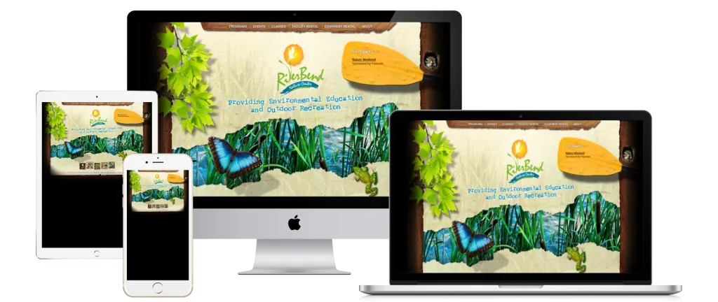
Current Website
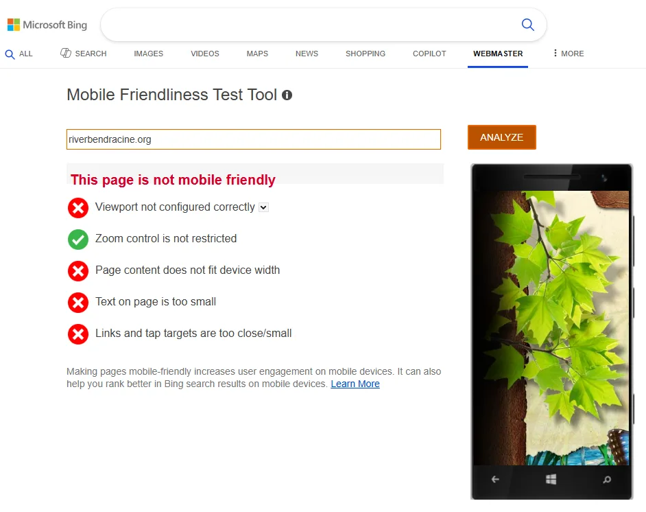
Performance data gathered from Google’s PageSpeed Insights and Microsoft Bing’s Mobile Friendliness Test Tool.
Key Challenges
Mobile Usability
Bing’s Mobile Test flags the current homepage as not mobile friendly: there is no responsive viewport, content spills off small screens, text is unreadably small, and tap targets overlap. Visitors must pinch and zoom, making on-the-go access frustrating and undermining accessibility for busy parents or supporters.
Not Mobile-Friendly
The layout does not adapt to different screen sizes. On a phone, the entire page shrinks, text becomes minuscule, and links appear tiny and cluttered. Basic usability standards are missed, creating a major barrier when more than half of web traffic is mobile.
Critical Actions Are Hidden
Registration and giving require extra steps. To join a camp or event, visitors must download a PDF form and email or mail it back. The donate option is buried in navigation or body copy. These obstacles deter engagement from people ready to act now.
Overwhelming Copy, No Clear CTAs
Important information is buried in long paragraphs that greet visitors with a solid wall of copy. There are few clear calls-to-action waving people toward Plan a Visit, Get Involved, or Donate, so newcomers feel lost.
Cluttered Navigation & Visual Design
The navigation lists every section and sub-page at once and does not collapse properly on mobile. Visually, inconsistent fonts and clipart-like graphics create an outdated scrapbook feel that erodes credibility with new audiences.
Undermined First Impressions
Combining poor mobile usability, hidden actions, and dated visuals fails to instill confidence. People form an opinion within seconds, and the current homepage risks losing support from those who do not already know River Bend’s impact.
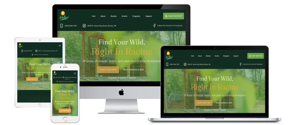
New Homepage Prototype: Solving the Problems
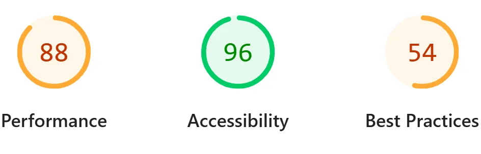
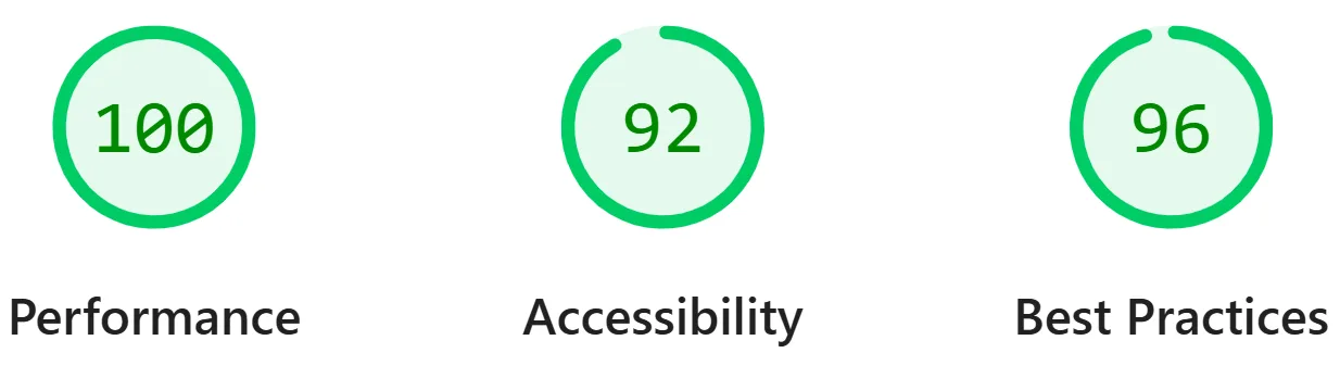
Performance data gathered from Google’s PageSpeed Insights and Microsoft Bing’s Mobile Friendliness Test Tool.
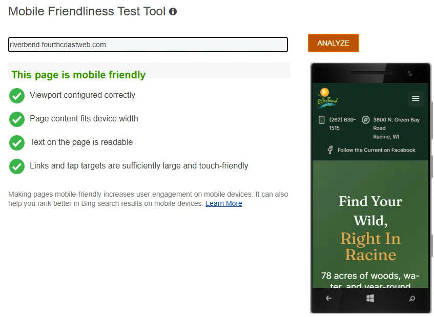
Mobile Usability – New Site
The redesigned homepage is clean, modern, and passes Bing’s mobile criteria: the viewport is set, content fits the screen, text is readable without zoom, and buttons accommodate fingers. The responsive hero (“Find Your Wild, Right in Racine”) immediately tells River Bend’s story on every device.
Mobile-First & Responsive Design
The prototype is built mobile-first and rearranges beautifully from phones to desktops. Text and buttons scale for touch, so parents can register for programs or plan visits in minutes from the trail or carpool line.
Lightning-Fast Performance
Despite richer visuals, the prototype earns a perfect 100/100 Lighthouse performance score compared to 88 on the old site. Largest contentful paint drops from about 3.7 seconds to roughly 1.3 seconds on mobile, nearly 3x faster for visitors.
Streamlined Navigation
Core user paths surface immediately. The simplified menu highlights Programs, Events, Rentals, Visit, and Donate in a single click. Homepage sections mirror that clarity with Upcoming Events, Plan Your Visit, and Support Us cards that are simple to scan.
Easy Online Registration & Giving
Integrated forms replace PDF downloads. Buttons like “Explore Programs” and “Book a Rental” lead directly to digital signups, while donations and memberships complete securely in one step. The path from inspiration to action is seamless.
Visually Compelling Storytelling
High-quality photos of trails, wildlife, and smiling families pair with concise copy to highlight River Bend’s value. Punchy headlines and consistent CTAs (“View Programs,” “Donate Now,” “Plan Your Visit”) project professionalism and build trust with funders and first-time visitors.
Before & After – Specific Improvements
Program Registration
Before
Families hunted for a PDF, printed it, then scanned or mailed it back to register.
After
Parents complete registration online in one sitting with clear buttons and payment options, removing paperwork barriers.
Navigation Menu
Before
An overwhelming list crowded the menu, and mobile navigation did not adapt, hiding essentials like events and rentals.
After
A concise structure groups youth programs under Programs and support opportunities under Donate/Join, with a clean mobile hamburger that expands only what is needed.
Donate Button Visibility
Before
A small text link hid the invitation to give, so inspired visitors often missed the chance to support River Bend.
After
A persistent Donate button in the header and highlighted CTA blocks keep giving front and center everywhere on the site.
Overall First Impression
Before
A text-heavy, scrapbook-style homepage raised doubts about River Bend’s vitality and professionalism.
After
A modern, mission-focused homepage aligns with River Bend’s energy, assuring donors and partners they are investing in a thriving organization.
Moving Forward
The prototype demonstrates how a refreshed website can dramatically improve user experience and engagement. Expanding this approach to the full site will help families discover programs, educators plan field trips on any device, and supporters donate with confidence. A modern site is a practical tool for advancing River Bend’s mission of connecting people with nature.
Recommendation
Embrace the new design across the entire site. The update will extend River Bend’s reach and impact by making it simple for people to sign up, show up, and support your work. The investment in a mobile-friendly, user-centric experience will save staff time and grow community engagement. With Jeanne’s leadership and River Bend’s powerful mission, the redesigned site becomes a gateway for more people to find their wild in Racine.